Monday, June 28, 2010
haha
Sunday, June 27, 2010
25th june 2010
its 1 year aniversary of MJ 's death
its date of korea war back in 1960
its the worst birthday i have ever.
slept for 4 hours for 2 days
had a agrue in the print shop in LKW
it spoilt my mood on my birthday
i have been waiting for more than 2 hours for printing and they kept printing their stuffs
okay fine, i took 2 printed boards n left n im not goin 2 pay unless they come to apologize.
n the worst thing is i missed the presentation that i really care about it.
lecturers are dissapointed because of my absence.
exhausted. no mood. no celebration. slept
anyway, received 100++ wishes in fb, sms, n calls
so warm.. thx guys
will update my ipoh "trip"
Sunday, June 20, 2010
important ways for doing presentation board
1. No background colour, preferably white, be plain because our focus is not on the striking background but rather on the content.
2. Use of less than 3 types of fonts, try to avoid using too many different sizes of words too to make it more formal, use fonts that are suitable (no curvy and must be easy to be understood).
3. Content (always begin with key plan to site plan and to plan (s) of the structure of your design, then elevations, sections, perspective, axonometric, isometric (sometime)).
4. Include development sketches, people love to read how you develop your idea and transform the first simple draft into final creative design in sketches.
5. Good skills in drawing manually – include rendering, shading and line weight skills to enhance the drawings and to put ‘life’ on your drawings as though it is real. Include the background and site context in drawings too. If you have drawing software and your lecturer asked you to use it, then use it. (if you know too).
6. Present your ideas in short but informative sentences (better in keywords and then you present your own ideas orally), no essays or paragraphs in presentation boards, people don’t love to read long words on boards.
7. Proper and systematic organization and composition of presentation boards, arrange all drawings, ideas (words), pictures, etc in term of its importance in the project.
8. The title should be clear that people will look at it first before going through your boards, remember no fancy colours too.
9. Remember to include your name on the boards too. If the boards are separated, then include your name on each board to show that it is your work. Be proud of your own masterpiece. Usually on bottom right hand corner of the board. It is better to have one long board rather than having separated ones.
10. Satisfy all the requirements set by your lecturers or clients. This is up to the demand of the one who will grade your work.
11. Pictures on the presentation boards should be clear and show clearly the aim of putting the pictures there too. However, pictures should not overwhelmed your overall boards. Drawings and sketches should be scanned into the file with accurate scale and with proper proportion.
12. Use the programme that you are comfortable with, that you know how to use efficiently on it in creating your boards – like Adobe Photoshop, Microsoft Word or Power Point (better to be the latest version, more functions). If you do not know, learn.
13. Never create all of your boards manually, no writing, no pasting, it will ruin it. If it is this way, the boards will look like collages rather than an efficient presentation boards.
14. Include your thinking (abstract) into the boards too, usually alongside with the main points (ideas) that you have stated on the boards. This will put you on top of others.
15. Provide some empty space to ‘free’ your boards. It is no good to have a board full of words, pictures, sketches, drawings squeezed together. If the lecturer limit you to certain number of boards, you can actually exceeds by one or two more, but don’t need to be too much. Remember, don’t include rubbish (non-related stuff) into your precious boards.
16. Neatness is important. After you have done your board and printed it out, do not fold them, put them in plastic folder and keep it safe till the day of submission. It is your valuable work, once destroyed, have to print again and waste money again.
17. Do not do your board at last minute work. It will totally ended up having a bad presentation boards. Try to manage your time, maybe today you will be doing on this part of boards, the other day on the others, and few more extra days for you to touch up and finalize your boards.
18. Be creative. This is the most important criteria for an architect. Try to show your creativity through the boards too, if you can. Remember, if you think you can, then you can!
19. Show which boards should come first if all your boards are separated – like Sheet One, Two, Three, …… Usually at bottom left hand corner of the boards. This will not confused your lecturers or clients as they are having look at these.
20. Try to communicate to the others (lecturers or clients or even friends) through the boards. Sound hard to get what I mean? This you have to think yourself. Your boards must attracts attention to all people (not through its striking colour, but through its content).
Thursday, June 17, 2010
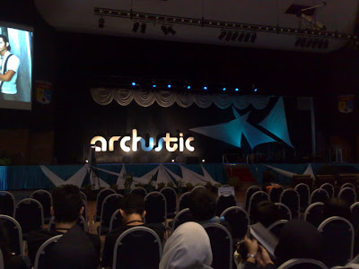
archustic workshop in ukm

work in campus until 3something in the morning but just finished the frame work


Tuesday, June 15, 2010
THINK
There was a blind girl who hated herself because she was blind.
She hated everyone, except her loving boyfriend. He was always there for her.
One day, she told him, "If I could only see you and the world, I would marry you.'''
One day, some one donated a pair of eyes for her.
When the bandages came off, she was able to see everything, including her boyfriend.
He asked her, "now that you can see me and the world, will you marry me?"
The girl looked at her boyfriend, and saw that he was blind.
The sight of his closed eyelids shocked her. She hadn't expected him to be blind.
The thought of looking at his closed eyes for the rest of her life led her to refuse to marry him.
Her boyfriend left in tears and days later wrote her a note saying,
"Take good care of your eyes, my dear, for before they were Yours, they were Mine.
Life is a Gift.
Before you say an unkind word - think of someone who can't speak.
Before you complain about food - think of someone who has nothing to eat.
Before you complain about your husband/wife - think of someone who is lonely.
Before you complain about life - think of someone who is no longer alive.
Monday, June 14, 2010
Wednesday, June 9, 2010
to be kind or not to be?
Monday, June 7, 2010
assignments


Friday, June 4, 2010
Wednesday, June 2, 2010
:/


